Work Order Monitoring Dashboard from Maximo Data
Monitoring Maintenance Activities Using Power Pivot and MxLoader
In today’s industrial world, maintenance is no longer just about repairing broken equipment. It has evolved into a critical function for ensuring the reliability, availability, efficiency, and operational continuity of an entire plant.
In a power plant, thousands of pieces of equipment operate continuously every day. Equipment such as:
– Boilers
– Turbines
– Pumps
– Conveyors
– Motors
– Valves
– Instruments
– Electrical Panels
must remain in excellent operating condition to ensure the power plant runs safely and reliably.
This is why maintenance activities must be properly recorded, monitored, and analyzed. One of the most effective ways to accomplish this is through a maintenance monitoring dashboard.
In this project, I developed a Work Order (WO) Monitoring Dashboard using IBM Maximo data with the following title:
“Work Order Monitoring Dashboard from Maximo Data using Power Pivot and MxLoader.”
This dashboard is a continuation of a previous project that focused on Service Requests and RAM (Reliability, Availability, and Maintainability).
While the previous dashboard primarily focused on:
– Service Request monitoring
– Equipment reliability
– Maintenance analysis
this dashboard emphasizes:
– Work Order monitoring
– Maintenance work status
– Maintenance team activities
– Maintenance trends across the power plant
The dashboard was built using a combination of:
– IBM Maximo
– MxLoader
– Microsoft Excel
– Power Pivot
– Dashboard Visualization
Although the tools are relatively simple, the final dashboard provides fast, intuitive, and effective maintenance monitoring.
What Is a Work Order?
Before exploring the dashboard, it’s important to understand what a Work Order is.
A Work Order (WO) is a document or work instruction used to perform maintenance activities.
A typical Work Order contains:
– Equipment name
– Job description
– Work location
– Responsible maintenance team
– Job status
– Priority level
– Scheduled execution time
A Work Order serves as the backbone of maintenance operations because nearly every maintenance activity is documented through it.
A Simple Work Order Example
For example:
– A conveyor experiences excessive vibration.
– The operator reports the issue.
– The maintenance team performs an inspection.
– The supervisor creates a Work Order.
– Technicians carry out the repair.
All of these activities are recorded within the Work Order system.
This is why monitoring Work Orders is essential for understanding the overall maintenance condition of a plant.
Why Build a Work Order Dashboard?
Large industrial facilities generate an enormous number of Work Orders.
Within a single month, there may be:
– Dozens
– Hundreds
– Even thousands of Work Orders
When viewed only as spreadsheets, the data becomes:
– Difficult to analyze
– Difficult to understand
– Difficult to use for decision-making
This dashboard was developed to:
– Simplify maintenance monitoring
– Identify maintenance trends
– Detect problematic equipment
– Monitor work status
– Support better decision-making
With a single dashboard screen, users can quickly understand the overall maintenance condition.
Tools Used
This project was developed using several core tools.
IBM Maximo
IBM Maximo is an Enterprise Asset Management (EAM) software platform used for:
– Asset management
– Maintenance management
– Work management
The dashboard’s primary data source comes directly from Maximo.
The imported data includes:
– Work Orders
– Equipment
– Maintenance teams
– Work status
– Work areas
– Maintenance history
Maximo serves as the central data repository for this project.
MxLoader
MxLoader acts as the bridge between Excel and Maximo.
Its functions include:
– Retrieving data from Maximo
– Exporting data
– Updating records
– Uploading data
– Synchronizing information
Advantages of MxLoader include:
– Easy to use
– No programming required
– Fast performance
– Lightweight operation
In this project, MxLoader keeps the dashboard updated with the latest maintenance data.
Microsoft Excel
Excel serves as the primary data processing tool.
It is used for:
– Data cleaning
– Sorting
– Filtering
– Pivot table creation
– Formula development
– Basic visualization
Although Excel appears simple, it remains an extremely powerful tool for industrial data analytics.
Power Pivot
Power Pivot enables more advanced data modeling.
Using Power Pivot allows us to:
– Connect multiple tables
– Build relationships
– Create DAX formulas
– Process large datasets
Power Pivot makes the dashboard more dynamic and significantly improves performance.
Dashboard Visualization
Once processed, the data is presented through various visualizations.
These include:
– Pie charts
– Donut charts
– Bar charts
– Ranking charts
– KPI indicators
– Interactive filters
The goal is to make the data easier to read, interpret, and analyze.
Dashboard Overview
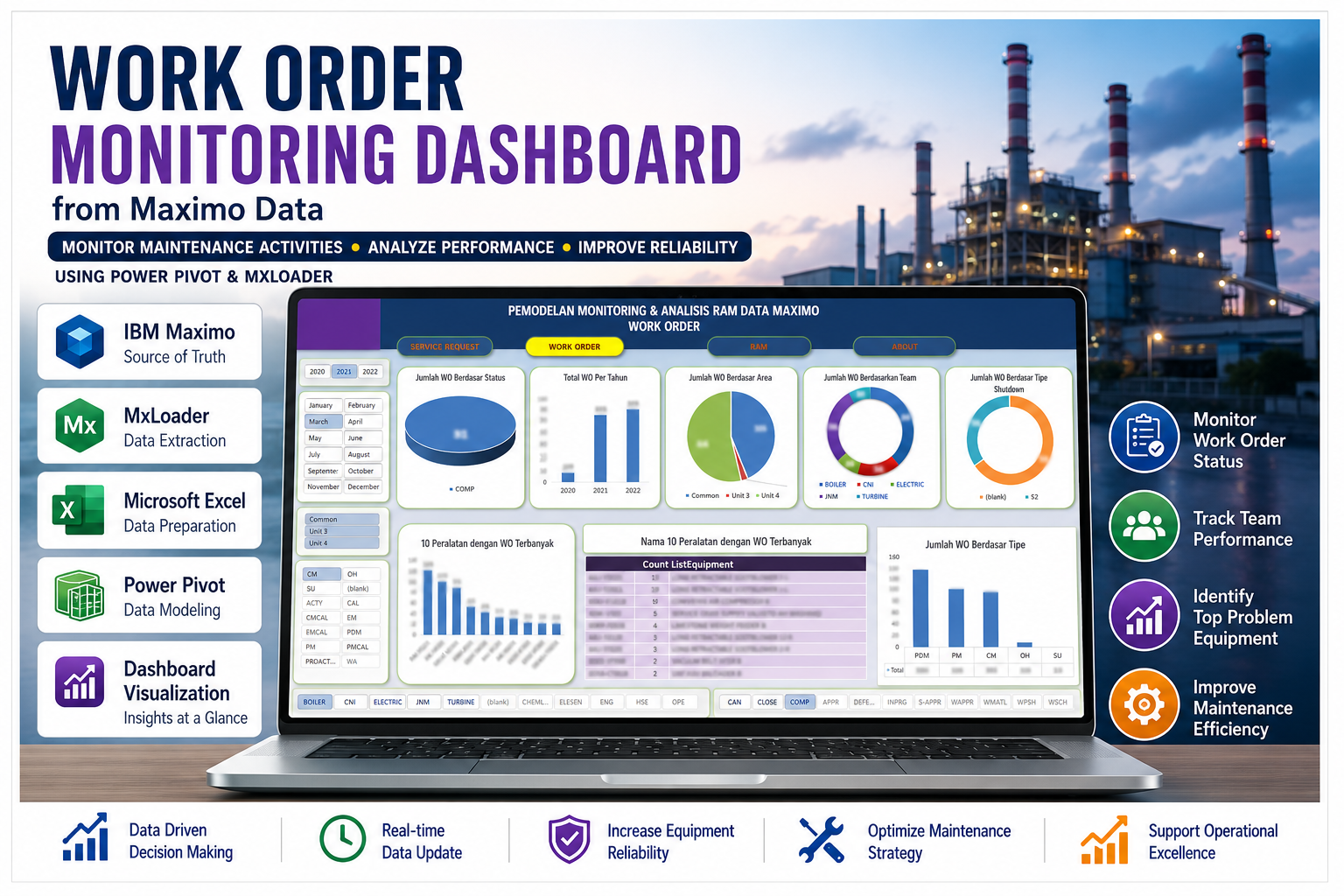
The dashboard is designed as a single-page interface, allowing users to view multiple maintenance metrics simultaneously.
For confidentiality reasons:
– Certain numerical values have been masked.
– Specific names have been blurred.
– Sensitive information has been intentionally omitted.
These measures help protect company confidentiality.
Year and Month Filters
On the left side of the dashboard, users can filter data by:
– Year
– Month
– Unit
– Work Type
These filters allow users to analyze data based on specific requirements.
Examples include:
– Viewing a particular year
– Viewing a specific month
– Displaying only Unit 3
– Displaying a particular maintenance activity
These filters make the dashboard flexible and interactive.
Work Orders by Status
The first section displays the number of Work Orders by status.
Typical statuses include:
– Complete
– Closed
– In Progress
– Waiting for Approval
– Others
This visualization helps users identify:
– Completed work
– Ongoing work
– Maintenance backlog
– Maintenance team effectiveness
If the number of “In Progress” Work Orders becomes unusually high, it may indicate:
– Insufficient manpower
– Delayed spare parts
– Inefficient scheduling
Total Work Orders by Year
The dashboard also displays annual Work Order trends.
This visualization helps users:
– Identify increases or decreases in maintenance activity
– Evaluate equipment reliability trends
– Assess maintenance strategies
If Work Orders increase dramatically, further investigation may be necessary to determine whether:
– Equipment is aging
– Preventive maintenance has become less effective
– Operating conditions have changed
Annual trend analysis plays an important role in maintenance planning.
Work Orders by Plant Area
The dashboard also shows the distribution of Work Orders across plant areas.
Examples include:
– Common Area
– Individual Units
– Boiler Area
– Turbine Area
This visualization helps:
– Identify areas with the highest maintenance workload
– Improve manpower allocation
– Determine maintenance priorities
Areas with exceptionally high Work Order counts may require additional inspections.
Work Orders by Maintenance Team
Another important visualization shows the distribution of Work Orders by maintenance team.
Examples include:
– Boiler Team
– Electrical Team
– Turbine Team
– CNI Team
– Others
This helps identify:
– The busiest teams
– Dominant maintenance areas
– Workload distribution among teams
For example, if the Boiler Team consistently has the highest Work Order count, it may indicate:
– Intensive boiler maintenance requirements
– Aging boiler equipment
– Increased operational loading
Work Orders by Maintenance Type
The dashboard also categorizes maintenance activities by maintenance type.
Examples include:
– PM (Preventive Maintenance)
– CM (Corrective Maintenance)
– PdM (Predictive Maintenance)
– OH (Overhaul)
This visualization provides valuable insight into the plant’s maintenance strategy.
Preventive Maintenance (PM)
Preventive Maintenance is performed before failures occur.
Examples include:
– Routine inspections
– Oil replacement
– Filter cleaning
PM improves equipment reliability and helps prevent unexpected failures.
Corrective Maintenance (CM)
Corrective Maintenance is performed after equipment failure occurs.
Examples include:
– Motor repair
– Bearing replacement
– Leaking valve repair
A high volume of Corrective Maintenance often indicates declining equipment reliability.
Predictive Maintenance (PdM)
Predictive Maintenance uses condition monitoring and operational data to predict future failures.
Examples include:
– Vibration analysis
– Thermography
– Oil analysis
PdM helps prevent major breakdowns before they occur.
Overhaul (OH)
An Overhaul is a major maintenance activity performed at scheduled intervals.
It typically includes:
– Equipment disassembly
– Detailed inspection
– Replacement of major components
Overhauls require extensive planning and significant investment.
Top 10 Equipment with the Highest Number of Work Orders
The dashboard ranks equipment based on the number of Work Orders generated.
This section is particularly valuable for:
– Identifying bad actor equipment
– Prioritizing maintenance
– Performing root cause analysis
If specific equipment consistently appears at the top of the ranking, further investigation is warranted.
Possible causes include:
– Poor equipment design
– Severe operating conditions
– Excessive vibration
– Inadequate lubrication
– Aging equipment
Equipment Names with the Highest Number of Work Orders
In addition to ranking charts, the dashboard also displays equipment names in detail.
This helps:
– Engineers
– Planners
– Supervisors
– Operators
quickly identify problematic equipment.
Team and Status Filters
Additional filters are available at the bottom of the dashboard, including:
– Team
– Work Status
These filters allow users to perform more detailed analysis.
Examples include:
– Viewing only Boiler Team work
– Displaying only Closed Work Orders
– Showing only Corrective Maintenance activities
These features make the dashboard more interactive and user-friendly.
Why Is This Dashboard Valuable?
There are several reasons why this dashboard is particularly useful for maintenance organizations.
Simple Yet Powerful
Although it was built using Excel and Power Pivot, the dashboard can:
– Process large volumes of data
– Generate meaningful insights
– Improve maintenance monitoring
This project demonstrates that simple tools can deliver impressive results when used effectively.
Easy to Understand
The visualizations are intentionally designed to be simple.
As a result:
– Engineers can quickly interpret the data.
– Operators can easily understand maintenance conditions.
– Management can make faster decisions.
The dashboard remains informative without becoming overly complex.
Supports Better Decision-Making
The dashboard helps identify:
– Priority equipment
– Problematic plant areas
– Maintenance trends
– Manpower distribution
– Maintenance strategies
This enables more data-driven decisions.
Easily Updated
Because it integrates MxLoader with IBM Maximo, the dashboard can be updated regularly.
This means:
– Manual data entry is minimized
– Monitoring becomes faster
– Reporting becomes more efficient
Challenges During Development
Developing the dashboard involved several challenges.
Data Quality Issues
Maintenance databases often contain problems such as:
– Duplicate records
– Inconsistent equipment names
– Missing data
– Inconsistent status values
Therefore, data cleaning became one of the most important development stages.
Large Data Volumes
Maintenance systems typically contain massive amounts of Work Order data.
Without proper optimization:
– Excel becomes slow
– Dashboard performance decreases
– Formulas become inefficient
Power Pivot played a critical role in overcoming these limitations.
Selecting the Right Visualizations
Not every chart is suitable for every dataset.
Common issues include:
– Too many colors
– Overcrowded charts
– Difficult-to-read information
For this reason, the dashboard was intentionally designed with simplicity as a priority.
Lessons Learned
This project provided several valuable insights.
Data Analytics Is Essential for Modern Engineers
Today’s engineers need more than technical knowledge about equipment.
They also need skills in:
– Data analytics
– Dashboard development
– Business intelligence
– Digital tools
Modern industry is rapidly moving toward digital transformation.
Dashboards Improve Efficiency
With an effective dashboard:
– Monitoring becomes faster
– Analysis becomes easier
– Reporting becomes more organized
Users no longer need to review thousands of spreadsheet rows manually.
Visualization Makes Data Easier to Understand
Visual dashboards make complex data much easier to interpret.
Trends that are difficult to identify in raw tables become immediately visible through charts.
Future Development Opportunities
This dashboard still has significant room for expansion.
Potential improvements include:
– Power BI integration
– Real-time monitoring
– Mobile dashboards
– Predictive maintenance
– AI-powered analytics
– Automated alarm systems
Power BI Integration
Migrating the dashboard to Power BI would provide several advantages:
– A more modern interface
– Easier report sharing
– Online accessibility
– Faster data refresh
Power BI represents an excellent next step toward digital maintenance transformation.
The Potential of Predictive Maintenance
Work Order data is an extremely valuable asset.
With further analysis, it can support:
– Failure prediction
– Downtime estimation
– Maintenance optimization
– Reliability analysis
The future of maintenance will become increasingly data-driven.
The Importance of Data Privacy
Maintenance information is considered sensitive industrial data.
For that reason:
– Certain numerical values have been masked.
– Specific names have been blurred.
– Confidential information has not been fully disclosed.
These precautions protect company information and maintain data security.
Conclusion
The project, “Work Order Monitoring Dashboard from Maximo Data using Power Pivot and MxLoader,” demonstrates how maintenance data can be transformed into valuable business intelligence.
By using:
– IBM Maximo
– MxLoader
– Microsoft Excel
– Power Pivot
large Work Order datasets can be converted into an intuitive visual dashboard that is easy to understand.
The dashboard helps organizations:
– Monitor maintenance activities
– Identify reliability trends
– Prioritize critical equipment
– Support data-driven decision-making
– Improve maintenance efficiency
Although it was built using relatively simple tools, the dashboard delivers meaningful insights for maintenance and reliability engineering.
Projects like this also demonstrate that modern engineers should develop expertise in:
– Data analytics
– Dashboard visualization
– Digital maintenance systems
As the industrial sector continues to evolve toward:
– Smart maintenance
– Digital transformation
– Predictive analytics
– Data-driven decision-making